
5周くらい回ってニコニコ動画ブームが私の中で巻き起こっているわけですが、YouTubeやBiliBili動画などのよく出来たサイトと比べると、ニコニコ動画の再生画面は旧態然としていて、使いにくさを感じちゃいます。
ので、ちゃちゃっとCSSを上書きしてYoutubeっぽくしてみました。
レイアウトの変更
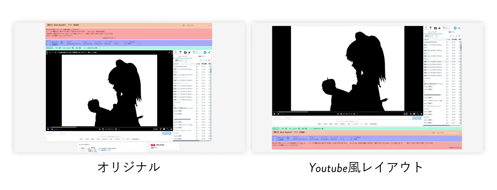
YouTubeっぽく、タイトル・投稿者コメは動画の下に来るようにしました。
動画開くたびに少し下にスクロールしないといけないのチョット面倒くさかったんです。
レスポンシブ化
動画のアスペクト比を16:9で固定して、後はいい感じ(適当)に動きます。
画面が細くなるとコメント欄が動画下に移動するよ!
その他細かい調整とおまけ
こっそり画面上部のニコニコニュースとプレミアムへの催促ポップアップを非表示にしてます。秘密ね
導入
Chrome拡張機能のStylusというものを使ってCSSを上書きしてるだけです。
Stylusインストール
ChromeウェブストアからStylusをインストールします。Chromeに追加をクリックするだけでOKです。
CSSを書き込む
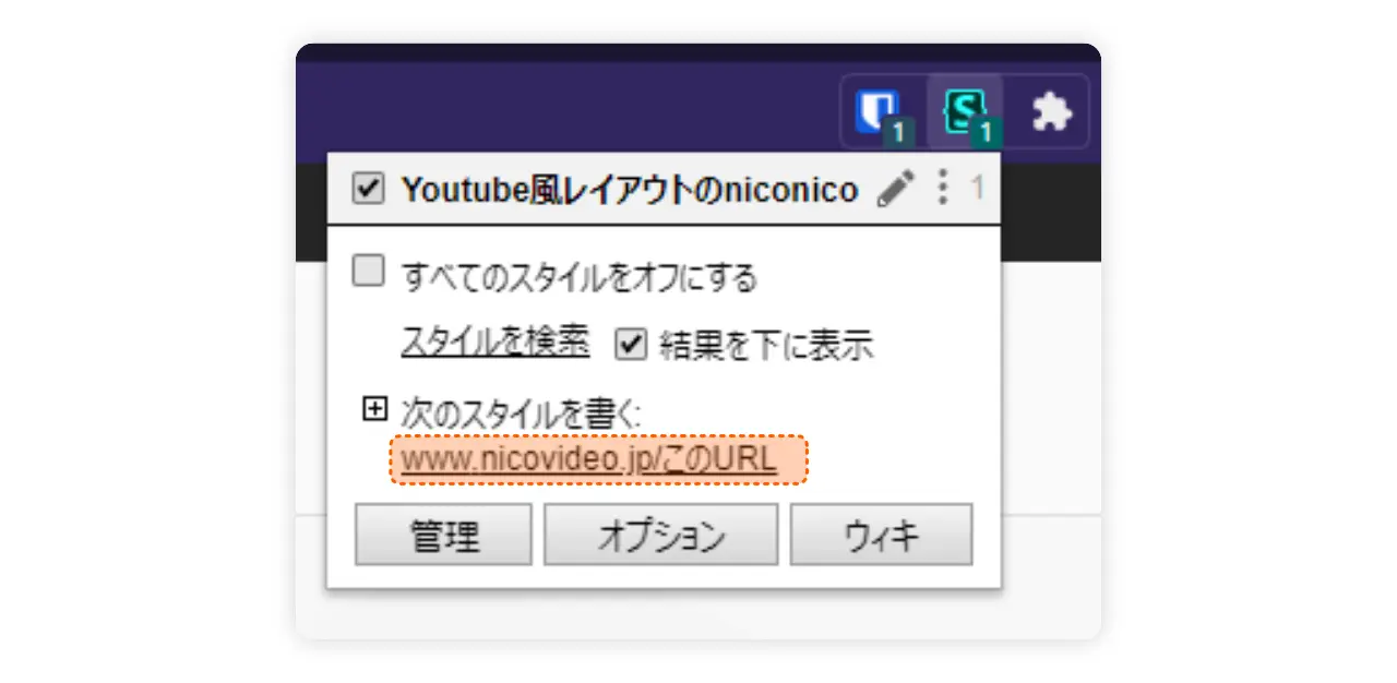
ニコニコ動画に行き、ブラウザ上部のChrome拡張機能のアイコンをクリックします。
すると上の画像のように出てくるのでURLが書かれた部分をクリックします。後は下のCSSをコピペして保存を押せば完了です。
/* ニュース非表示 */
.MainContainer-marquee{
    display:none;
}

/* プレミアム登録催促バナー非表示 */
.VideoOverlayContainer *{
    display:none;
}

/* 動画サイズレスポンシブに */

.PlayerContainer > .VideoContainer{
    width:auto;
    height:100%;
    aspect-ratio:16/9;
}

@media screen and (min-width: 1286px) and (min-height: 590px){
    body.is-autoResize:not(.is-fullscreen) .VideoContainer{
        width:auto;
        height:100%;
        aspect-ratio:16/9;
    }
}

@media screen and (min-width: 1392px) and (min-height: 650px) {
    body.is-autoResize:not(.is-fullscreen) .VideoContainer{
        width:auto;
        height:100%;
        aspect-ratio:16/9;
}
}

/* Youtube風なレイアウトに */

.MainContainer{
    margin-top:3em;
}

.WatchAppContainer-main{
     display:flex;
     flex-direction:column;
}

@media screen and (min-width: 1736px) and (min-height: 850px),screen and (min-width: 1392px) and (min-height: 650px),screen and (min-width: 1286px) and (min-height: 590px){
    body.is-autoResize .WatchAppContainer-main{
        display:flex;
        flex-direction:column;
    }
}

.HeaderContainer{
    display:flex;
    flex-direction:column;
    order:1;
    padding:0;
}

.BottomContainer{
    order:2;
}

/* タイトル 投稿者&コメ 並び替え*/

.HeaderContainer-topArea{
    order:2;
}
.HeaderContainer-row{
    order:3;
}

.TagContainer{
    order:1;
}
.VideoDescriptionContainer{
    order:4;
}


/* コメントをレスポンシブに */

@media screen and (max-width: 1286px) {
.MainContainer-playerPanel{
    position:relative;
    width:100%;
    height:25vh;
}
.MainContainer-player{
    width:100%
}
}

/* 下部レスポンシブ */
@media screen and (max-width: 1286px) {
    .BottomContainer-main{
        flex-direction:column;
    }
    .BottomSideContainer{
    width:100%
    }
    .BottomMainContainer{
    padding-right:initial;
    }
    .BottomContainer {
    width:100%;
    }
    .VideoGenreMeta,.GenreRankMeta{display:none}
    .MainContainer{
        margin-top:0;
    }
}
.FooterContainer{
    min-width:initial;
}
.FooterContainer-informationInner{
    width:100%;
}
.FooterContainer-additionalsInner{
    width:100%;
}

/* その他調整 */
body,html{
    min-width:initial;
}

.WatchAppContainer-main{
    width:100%;
  max-width:1920px;
}

@media screen and (min-width: 1736px) and (min-height: 850px){
    body.is-autoResize .WatchAppContainer-main{
        width:min(80vw,1920px)
    }
}

.nico-CommonHeaderRoot .common-header-h0l8yl{
    max-width:initial;
    min-width:initial;
    width:clamp(100px,100%,1024px);
}

.VideoDescriptionContainer{
    width:100%;
}
.BottomContainer{
    margin-top:3em
}
.baselayout{
    overflow:hidden;
}
さらに使いやすく。おすすめ拡張機能
2つ拡張機能を入れてます。
- niconico Darkmode – ダークモード化してくれます。
- niconico click to play – 画面のクリックで再生/停止ができるようになります。
まとめ「CSSを学ぶコスパがすごい」
ブログをやったりHPを作ったりしなくても、CSSができればこんな風に他人の作った改造するなんていう使い方もできちゃいます。実際私はニコニコの他にもYouTubeやTVerも改造してます。
CSSは3日もあれば大体理解出来てしまうので、AHKに並ぶ仕事効率化ツールとして見るのも面白いかもしれません。